

Teal and Turquoise: Is there really a difference?


This week that divisive, controversial question came up again: What is the difference between teal and turquoise? Not to mention aqua? These colors have been extremely popular in fashion, art, and design, yet they are often used interchangeably, despite having very different usages.
Teal is a deep blue-green. It is often more green than blue. It is calming and elegant and subtle.

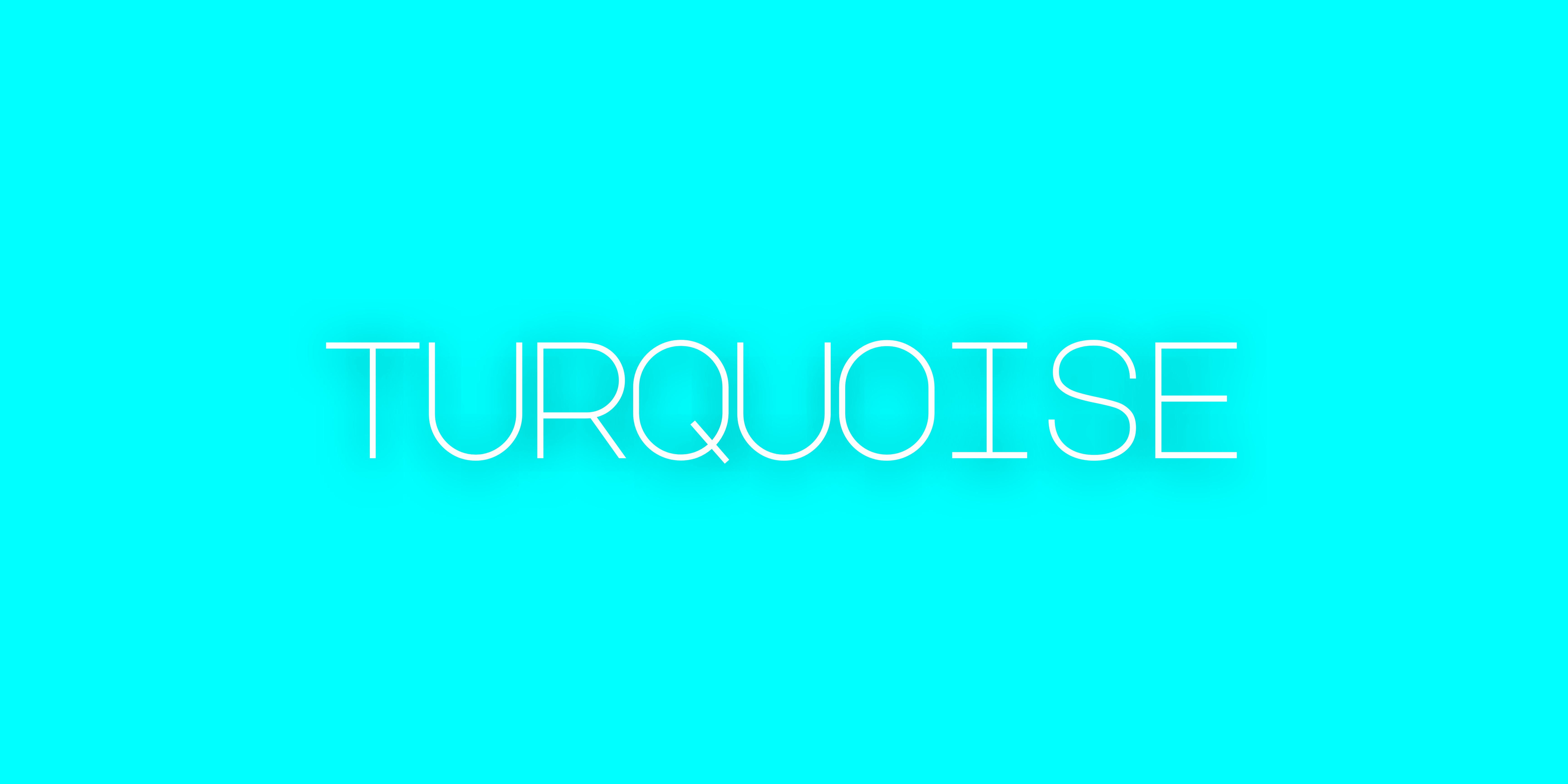
Turquoise is less sophisticated. It is an vibrant blue-green that is cheerful and energetic.
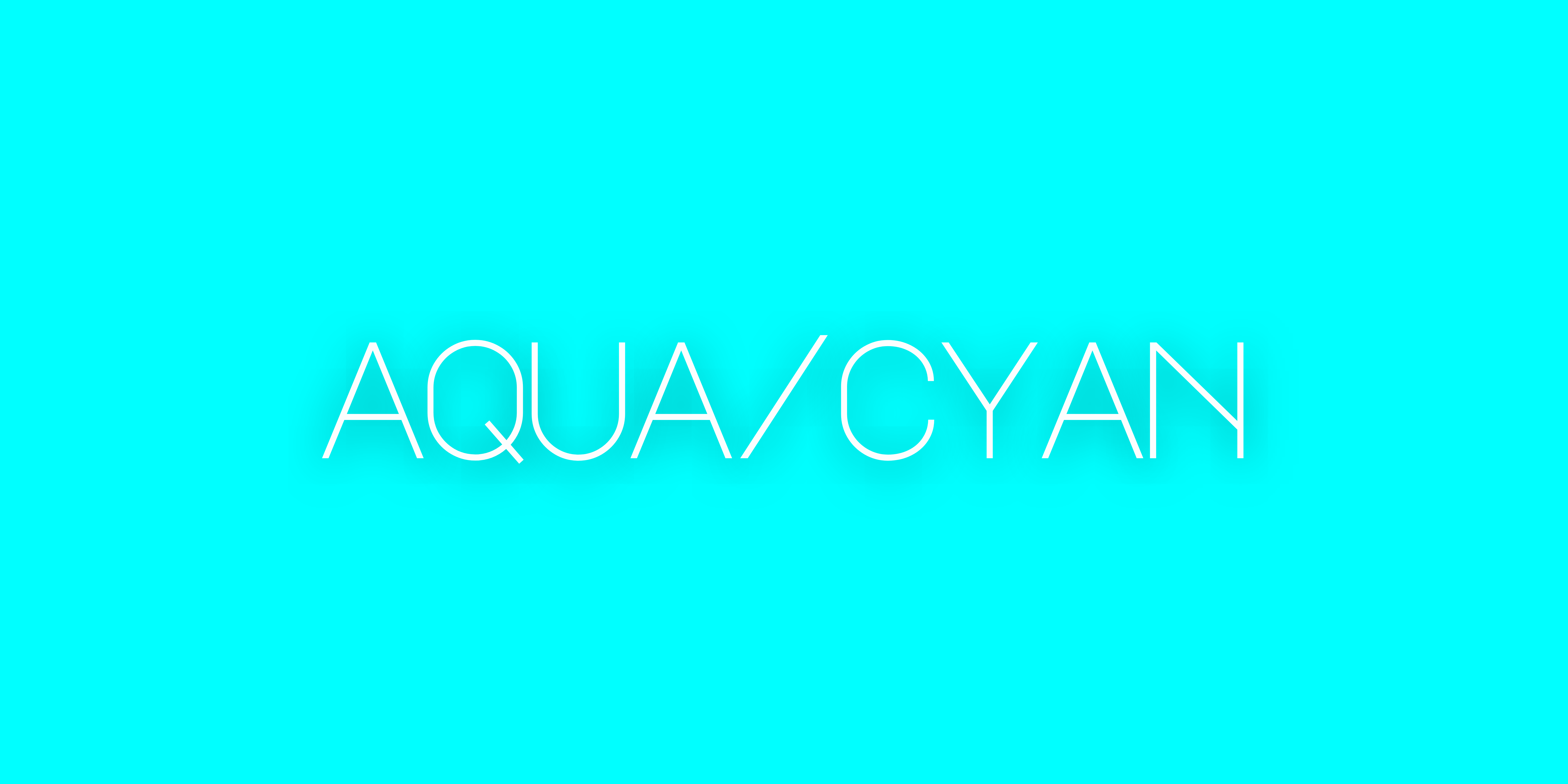
Aqua, on the other hand, is even more bright than turquoise. It is also known as cyan. (And yes, this is where we get the word cyanide, because one of the compounds in cyanide is blue.)
While teal, turquoise, and aqua are similar colors, they have different uses. Teal conveys a sense of stable tranquility, rest, elegance, and vintage styles and looks good with white, grey, coral and mustard. Turquoise is considered refreshing and energizing and has more of a southwest or Bohemian look to it. It looks good with white, coral, brown, gold, and pink. While these color names are easy to mix up, confusing the colors themselves will make whatever you're envisioning look very different in real life.
One last interesting thing about the colors are the origins of the words "teal" and "turquoise." "Teal" comes from the name of a European duck that wears a green-blue stripe on his head. "Turquoise" means "from Turkey," because the blue-green colored stone known to the Europeans as turquoise was imported from Turkey.
I'm still working on the upcoming blog series, I'm 2 1/2 posts done out of approximately 9. I can't wait to share them with you. If you're not already subscribed, you can do that here.